Montessorium
as lead designer, i helped build children’s learning apps, a parenting app, and Tooder, which paired machine learning with physical flashcards. our small team shaped each product through identity, photography, film, marketing, and copy.
i wanted learning to feel inviting and tactile, with clear interactions that respected children’s attention and left room for discovery.
role
lead designer
timeframe
August 2015–July 2018
scope
app ui/ux, brand identity, marketing, photography, copywriting, and product launches
team
a core team of about three, working with development partner Y Media Labs
bringing Montessori to more children
Montessorium was a small Sioux Falls studio with a global audience and a reputation for thoughtful design. we translated Montessori learning materials into digital experiences, making that approach available to children well beyond the classroom.
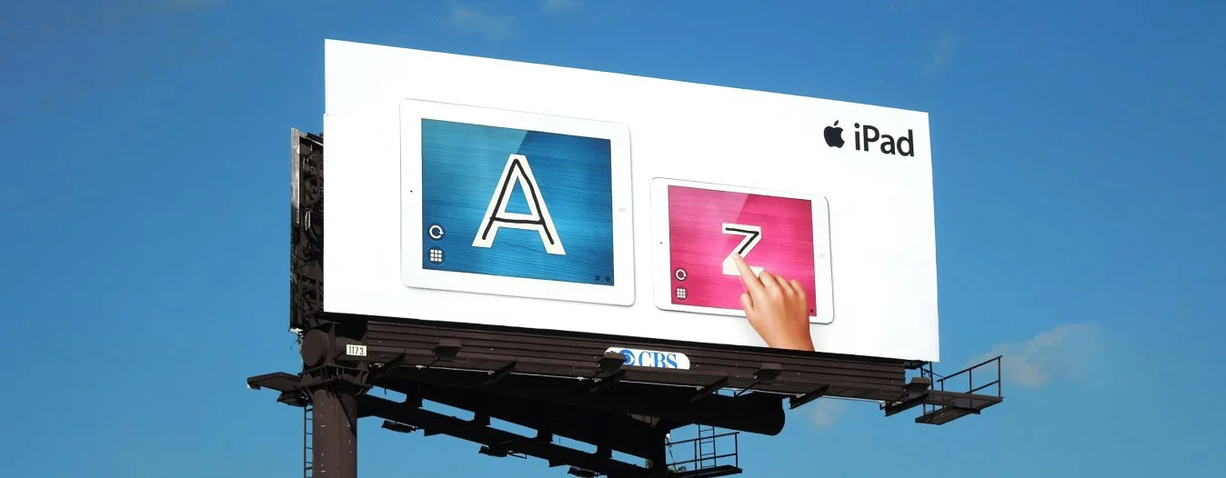
Intro to Letters on an Apple iPad mini launch billboard, 2013.
“very well-designed and smartly implemented.”
“abcs and 123s apps your kids will actually enjoy”
Wired / GeekDad · Jonathan H. Liu
“Intro to Letters is a gorgeous app that teaches children to read & write letters in a simple, beautiful setting.”
“minimalist yet engaging, the sleekly designed app makes self-directed learning what it should be: fun, simple, yet effective.”
designing for discovery
for children just learning to read, simplicity comes first. i designed around clear interactions, tactile feedback, and the freedom to explore.
as in a Montessori classroom, curiosity set the pace. we gave children room to choose an activity and stay with it, without pulling their attention elsewhere.
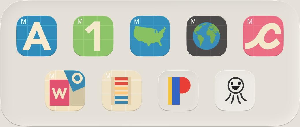
a family of learning experiences, each with its own identity.
the material as interface
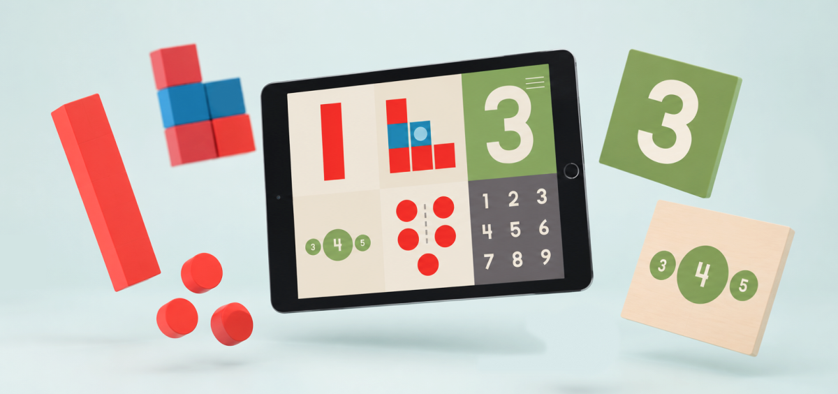
Intro to Math
numbers you can work with
Intro to Math brings number rods, numerals, and counters to the screen. i redesigned the app to make their relationships clear while staying true to the way the physical materials teach.
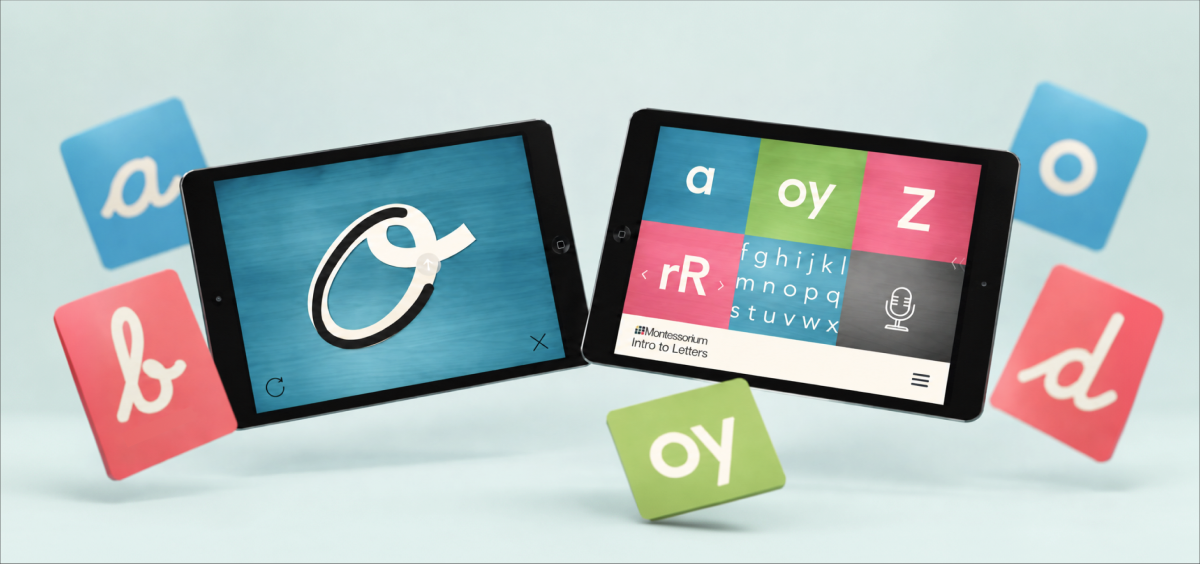
Intro to Letters and Intro to Cursive
letters take shape through movement
in Letters and Cursive, the letterforms lead. children trace each shape, with haptic feedback and subtle sound giving the movement a sense of touch. the interface leaves room to practice and repeat.
different subjects, a familiar approach
each layout follows the subject. Intro to Words centers on building with letters, Colors on comparing and sorting, and Geography on the shapes of places. a shared visual language connects the apps while giving each its own character.
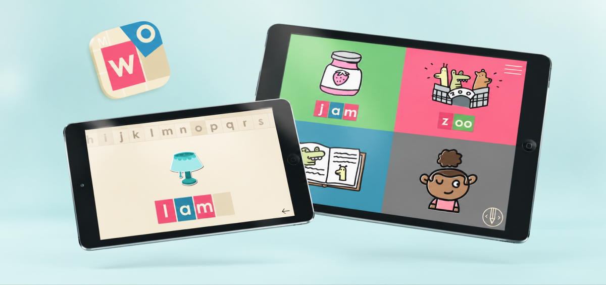
Intro to Words
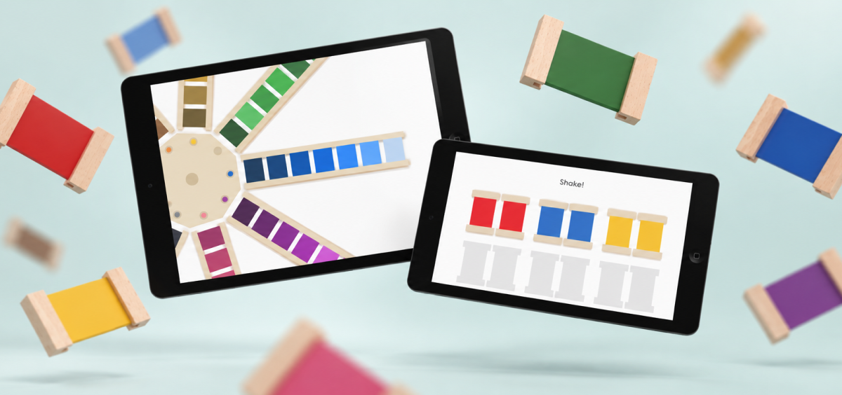
Intro to Colors
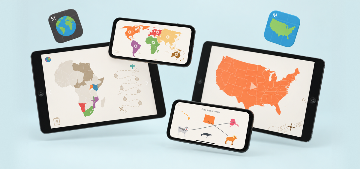
Intro to Geography / exploring the United States and the world through maps and puzzles
a little help for the grown-ups
for Primary, we created an identity and app experience for parents, bringing advice, activities, articles, and community into everyday life. it also gave parents a central place to explore our learning apps.
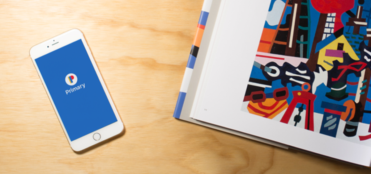
Primary / brand, app design, and product photography
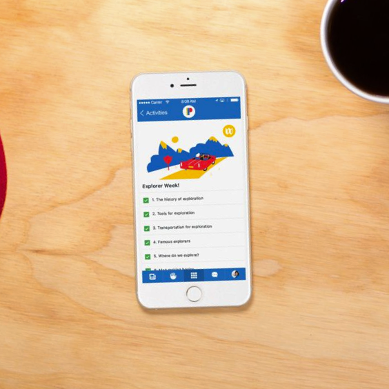
activities give families a starting point for learning together.
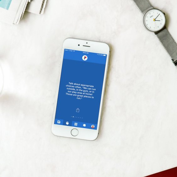
short, practical advice gives parents something to try that day.
bringing learning back into their hands
Tooder connected physical flashcards to an iPad. a child could hold a card up to the camera and see the app respond. we made that exchange easy to understand, while keeping the cards useful for holding, sorting, and sharing.
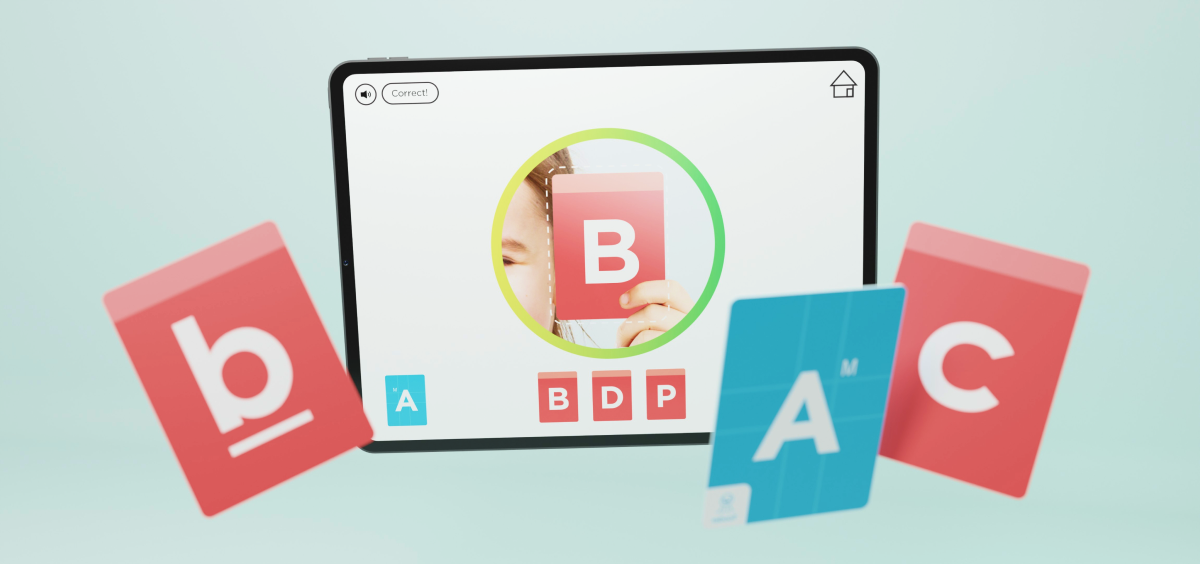
Tooder / physical cards, app experience, and campaign design
i designed the cards, app, identity, packaging, merchandise, and campaign materials. working across them helped me connect how Tooder looked, how it behaved, and how we introduced it to families.
we brought Tooder to Kickstarter in 2018. the campaign paused during Montessorium’s acquisition, leaving the work as a prototype and campaign.
explore the project
Tooder: smart flashcards for curious kids
see the app, physical cards, and campaign film in the full Tooder project.
the reach of the work
10M+
company-wide app downloads by April 2019
my work supported a family of apps with more than 10 million downloads by April 2019. Primary, whose identity and app experience i designed, earned a place in Apple’s New Apps We Love collection.
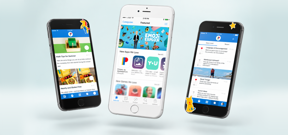
Primary featured in Apple’s New Apps We Love collection.
from established learning apps to new products for families, i brought the same care to the interface, identity, photography, and marketing.
what i took forward
designing for children taught me to make the next step understandable without deciding it for them. a clear interface can give someone confidence and still leave room for curiosity.
i’ve carried that respect for people’s attention into my product work. designing everything from interactions to packaging also taught me to judge the whole experience, including the promises we make before someone ever opens the app.
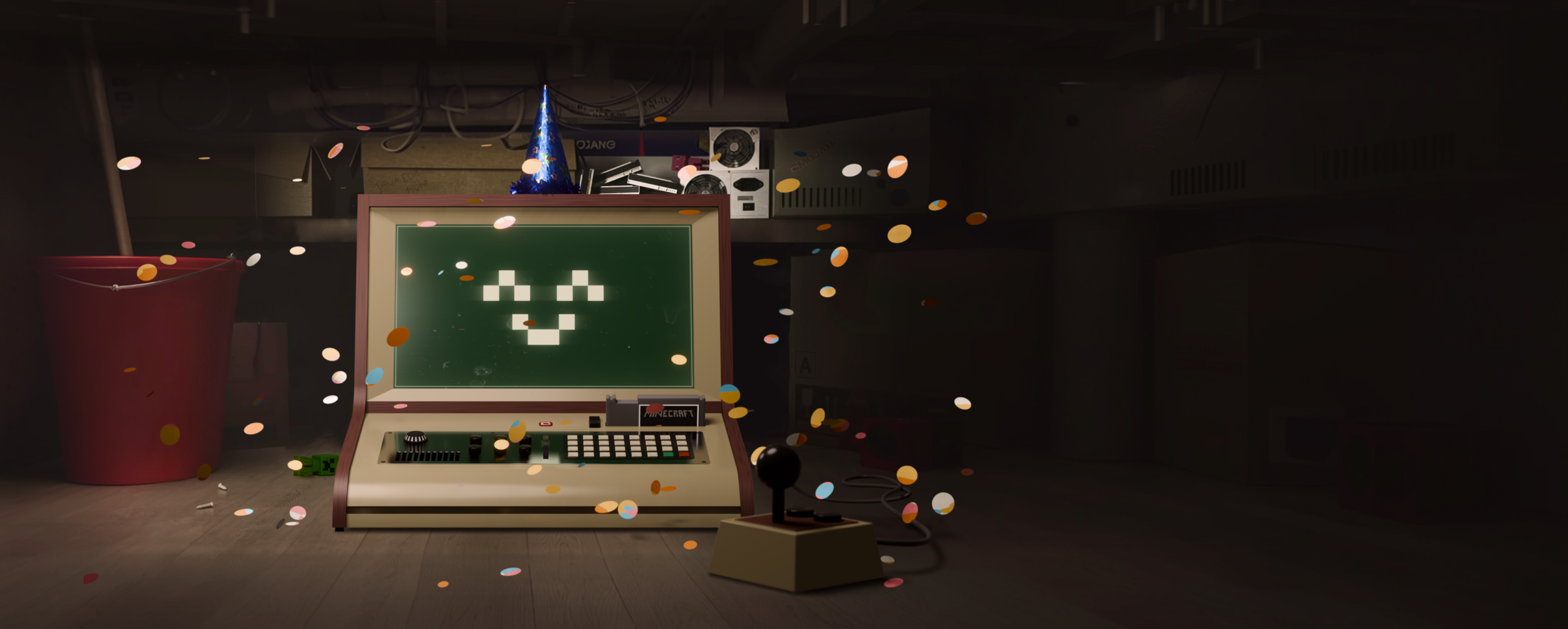
minecraft.net redesign

minecraft dungeons ii launch
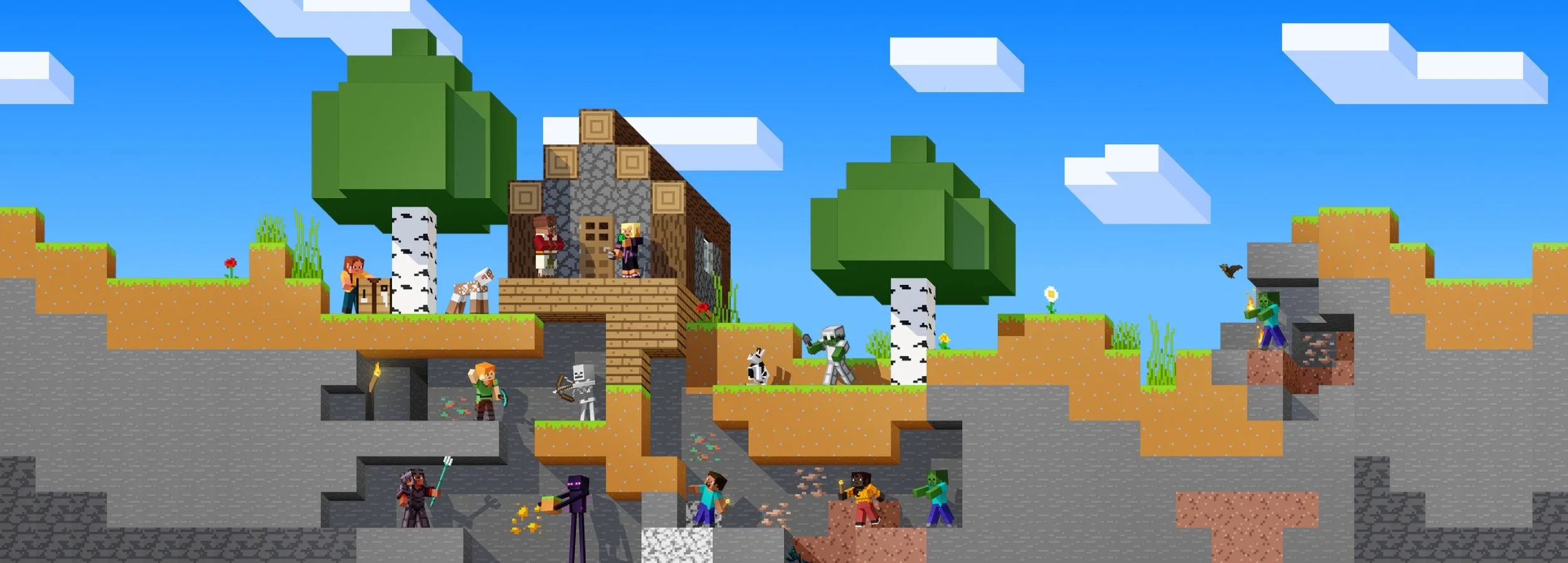
minecraft 15th anniversary
minecraft marketplace redesign
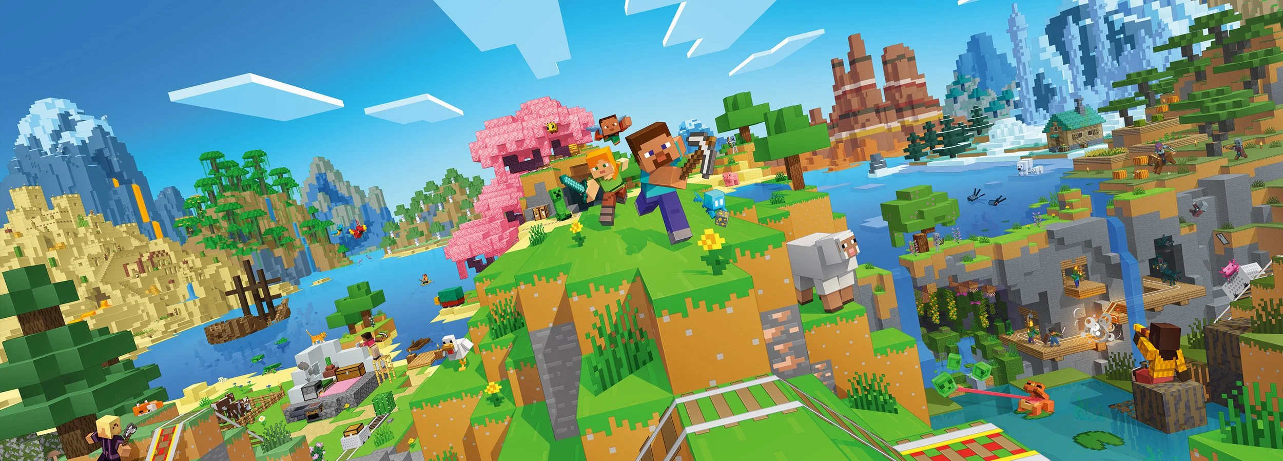
minecraft.net purchase redesign
minecoins on web

minecraft dynamic hero
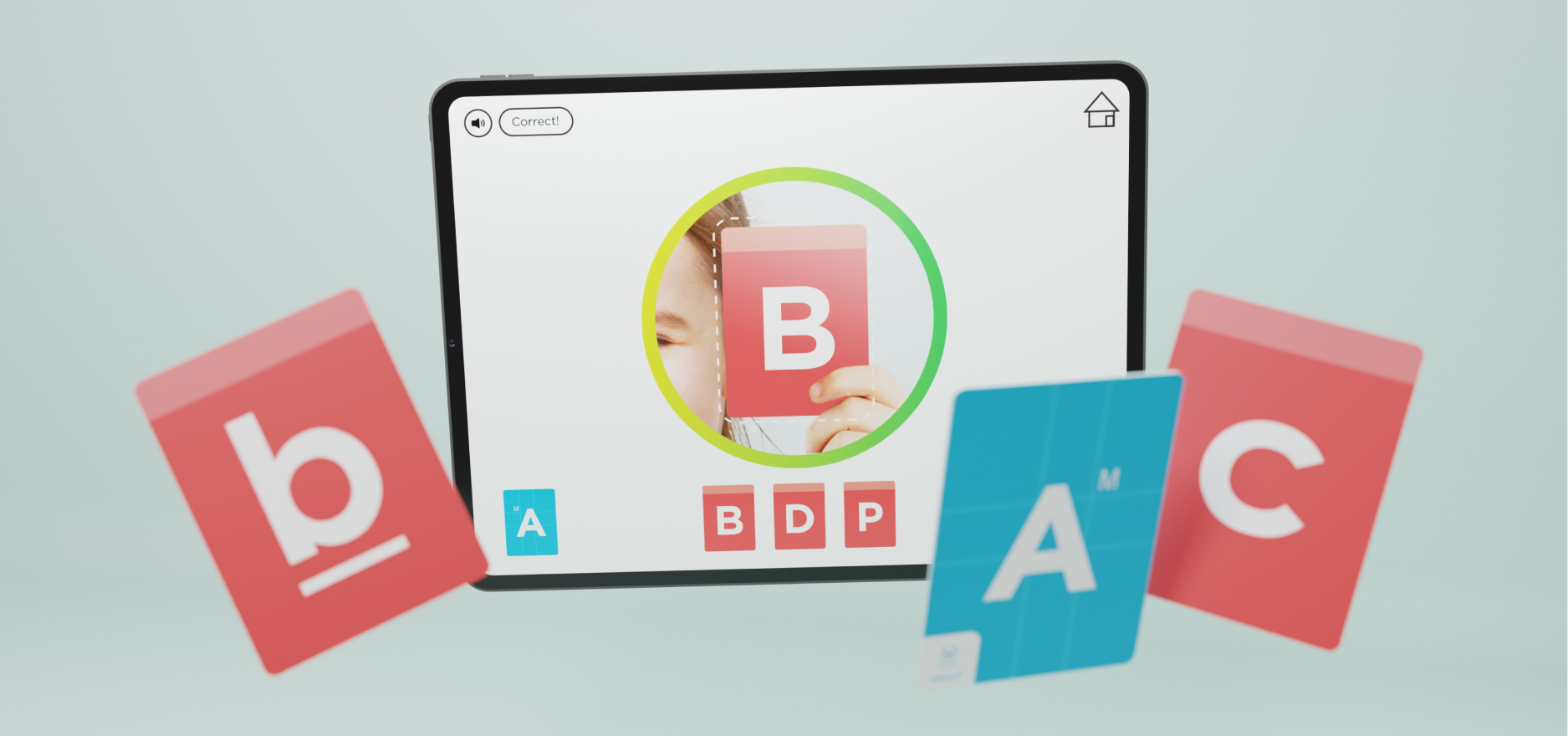
tooder

warlocks

voice of the theater
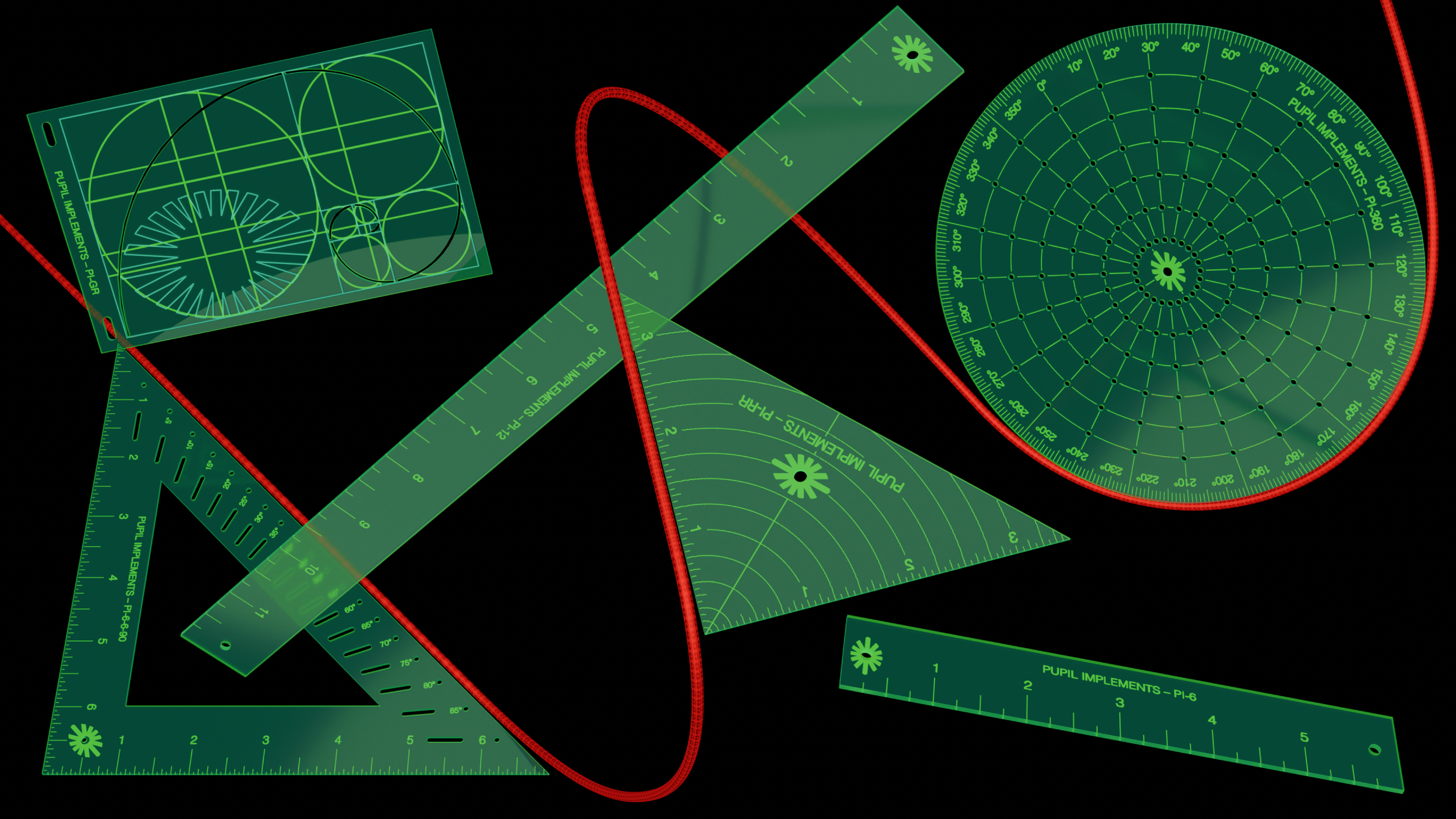
pupil implements

screen prints

voyager ii

cpu-2

voyager i